Problem 1:
(B) You need to give me an explanation using CORRECT statistical terminology to get full credit. Just writing "Central Limit Theorem," is going to earn you about a 2/10.....
Problem 2:
(A) You will have two x-bars for this question. This question is a bit tricky - my advice is to draw a picture of a Normal Curve and shade the area that you're trying to find. Once you find your answer, ask yourself, "Does this make sense?" You are finding the probability that it will shut down, or NOT work....
(B) I recommend finding what two standard deviations from the mean would be, first, then use those two values to find two separate z-scores. The difference of those two z-scores is your answer.
Problem 3:
This is a tough one because it doesn't explicitly tell you what the means are. Consider the population mean to be the total baggage limit divided by the number of passengers on the flight. It gives you the standard deviation, and suppose your sample mean is represented by the individual passenger.
EARLY CHRISTMAS PRESENT - Skip number four on the problem set. It is worded poorly. Instead of taking paragraphs on paragraphs to explain it, just don't worry about it - Happy Holidays.
Problem 5:
(A) Change p-hat to p. The mean is already given to you (think about what p=0.5 represents...) and standard deviation by doing the square root of p(1-p)/n
(C) Remember that you're looking for the upper part of the curve here, so think about what you would need to do to your probabilities to get the correct answer...
(D) Think about the Central Limit Theorem here, and the computer program that I showed you in class. What happens to the Normal Curve when there are more observations? And because of the way the Normal Curve looks, what then should happen to your probabilities?
Tuesday, December 17, 2013
Monday, December 16, 2013
Sampling Distributions with Proportions
Sampling distributions with proportions are very similar sampling distributions with means. We are still going to use the z-score formula, but we're going to use it with proportions parameters. They are:
p-hat, the sample proportion (instead of x-bar)
p, the population proportion (instead of mu)
std. dev. of p, which is found by taking the square root of p(1-p)/n
and n, the number of observations.
Use the same z-score formula (sample-population/std. dev) to solve.
I realize that this explanation is kind of vague, so please check the link below for a video example of how to solve this type of problem:
Saturday, December 14, 2013
Central Limit Theorem
The Central Limit Theorem says that, with more observations, a distribution appears to look more and more like a Normal Curve (bell-shaped). With too few observations, the curve is too flat and we can't assume Normality, which means we cannot use Normalcdf.
The AP Stats rule is that, if the population standard deviation is known and if n>= 30 observations, then we can assume that the distribution takes a Normal Shape. If n is fewer than 30, then we can't use the Normal Distribution. We will have to use something called the t-distribution, which we won't go over until the beginning of next year.
The AP Stats rule is that, if the population standard deviation is known and if n>= 30 observations, then we can assume that the distribution takes a Normal Shape. If n is fewer than 30, then we can't use the Normal Distribution. We will have to use something called the t-distribution, which we won't go over until the beginning of next year.
Conceptual Stuff about Sampling Distributions
Here are a few key stats-y points about sampling distributions that you want to keep in mind, especially when you are doing your problem set (10 bonus points if you recommend me a good workout song at the end of your problem set!).
1. If your z-score is positive, then your x-bar should be greater than your mu. If your z-score is negative, then your x-bar should be lower than the mu. If they are the same, then the z-score should be zero and your probability will be 50%.
2. When n is low, the z-score becomes smaller. When n is higher, the z-score becomes larger (if all other variables are held constant).
3. Your z-score represents how many standard deviations your sample mean is from your population mean. If the z-score is within + or - 3 standard deviations from the mean, then we can assume that the sample is representative of the population without calculating the probability. If the z-score is more than -3 or +3 standard deviations from the mean, then are sample mean is too far from the population mean to say that the sample accurately represents the population.
4. If a problem asks you to find the probability that the sample is "between" two different sample means, find the probability of the first (Normalcdf(first z-score)), then find the probability of the second (Normalcdf(second z-score)), then subtract those probabilities.
Remember that a probability MUST be between zero and one - ALWAYS!!!
Intro to Sampling Distributions
A sampling distribution is a distribution based around a sample statistic, such as x-bar. We would much rather use the information from the population (mu) instead, but sometimes that information is not available or sometimes it is too hard/not possible to sample an entire population. So, we use a sampling distribution instead.
The main question then becomes: if we take a sample from the population, what is the probability that the sample statistic (x-bar) is actually representative of the population statistic (mu)? In other words, are the sample and population close enough to one another that they are essentially the same? That depends. To find out, we need a sample mean, a population mean, a population standard deviation, and n, which is the number of observations in the sample. Plug these values into the z-score formula
z = (x-bar - u)/(sigma/rad(n)). (Awkward writing the formula in the blog without all of the math symbols!)
This will give you the z-score. Then, plug this value into Normalcdf, and this will give you the probability that our sample represents the population. Note: if your x-bar is higher than mu, do 1-Normalcdf instead.
Monday, December 9, 2013
Hints for Problem Set 9
Problem 1: I am looking for a paragraph answer. Please be specific. If you choose to design an experiment, you may include an experiment diagram to SUPPORT your answer but that should not be your entire answer.
Problem 2: positively skewed means skewed to the right and negatively skewed means skewed to the left. You may use the TI to calculate your boxplot but you must include a scale and titles for full credit.
Problem 3: binomial/geometric probabilities, think about the stuff we just covered.
Problem 4: when you comment on the differences for both histograms that you made, with titles labels and a scale, use CUSS to do this most effectively, and comparator language.
Problem 5: this is probably the most challenging question. Note that you cannot describe linearity without a scatter plot. There are several key calculator functions that you'll need to do this problem - check your notes. Note that we determine transformations using improvements in both the residual plot and in r-squared. Don't forget to put the transformed variable in your new regression equation(ex y =3.2logx + 7)
If you need help for question 5, or any other question for that matter, please contact me directly or come after school tomorrow. Remember to always write in complete sentences and to never begin a sentence with "because"
Tuesday, December 3, 2013
Binomial Distribution to Normal Curve
Today we discussed instances where the binomial distribution could be transformed into the Normal Curve (because the Normal Curve is more accurate). This can happen if the number of trials (n) times the probability (p) is greater than 10. In other words:
np >= 10 for us to use the normal curve.
To solve, we must recall that the average of a binomial distribution is np, and the standard deviation of a normal distribution is the square root of np(1-p). If we're using the Normal curve, then we must use a z-score (because we use z-scores with Normal Curves). Remember that the formula for a z-score is:
z = x-bar - mu/std. dev.
Calculate the mean (although you already should have, to check the assumption for Normal Curve) and the standard deviation, then plug it into the formula to get your z-score. Once you have your z-score, plug this into Normalcdf(z-score) and that will give you your probability!
Don't forget that we would do 1 - Normalcdf(z-score) if we wanted the top half of the curve.
The example that we did at the end of class today was: Suppose that there is a 5% chance that Mr. Guyton stops you in the hallway. If Amber surveys 300 students, what is the probability that less than 16 of them will have been stopped by Mr. Guyton?
For a video solution to this, please click here:
Monday, December 2, 2013
Binomial and Expected Value open response
We did two tough problems in class today! Well done for those of you who followed along and gave it your best shot. VERY impressed with the efforts considering that it was the first day back from a holiday break.
For the second problem that we did, I realize that we didn't get to part D in class. For those of you interested in increasing your statistical knowledge, here's a video solution to part D problem 2 (the one from 2005).
http://www.educreations.com/lesson/view/2005-part-d/14386947/?s=AHSFQB&ref=app
For the second problem that we did, I realize that we didn't get to part D in class. For those of you interested in increasing your statistical knowledge, here's a video solution to part D problem 2 (the one from 2005).
http://www.educreations.com/lesson/view/2005-part-d/14386947/?s=AHSFQB&ref=app
Thursday, November 21, 2013
Problem Set 8 Hints
For better or for worse, I decided to do this round of hints as a series of videos. Check them out to get some information (and even some picture hints!) on how to solve these questions. There is a hint for every problem except number two, that one was pretty straightforward.
Don't forget to interpret in the context of the problem, use complete sentences, and bring your hot chips inspired dish for the Thanksgiving Iron Chef Competitin tomorrow!! +10 bonus points if you participate!!
http://www.educreations.com/lesson/view/probset8hints1/14020302/?s=aIbFX6&ref=app
http://www.educreations.com/lesson/view/probset8hints3/14020390/?s=MmLbqF&ref=app
http://www.educreations.com/lesson/view/probset8hints4/14020456/?s=9BEMj3&ref=app
http://www.educreations.com/lesson/view/probset8hints5/14020511/?s=8mHmXV&ref=app
Enjoy!
Monday, November 18, 2013
Binomial Distributions
Binomial distributions are discrete distributions where x, the random variable, can either succeed or fail at something. The problem will give you a probability (of success or failure), a number of trials, and how many successes they are looking for. Your answer will be a probability and should be written in the form p(x = c) where c is the number that you are looking for in the problem.
We made binomial distributions in class today based off of tables and of graphs. Either one conveys the same information. I also discussed how to do this in the calculator. Go to 2nd - vars, then scroll down to binompdf. From there, type in the number of trials, the probability as a decimal between 0 and 1, and the number of successes.
Your answer should be interpreted as:"The binomial probability of getting (number of successes) given (number of trials) and (probability) of success is (your answer)."
Sunday, November 17, 2013
Discrete and Uniform Distributions
A distribution is what the data looks like (to put it in very simplified terms). Distributions can either be discrete (exact values) or continuous (infinite decimal values). When we simulate a distribution, the center of the distribution/highest peak becomes known as the expected value of the distribution. This means that, given no other information, we'd expect a random trial to give us that value because it is the most common.
A uniform distribution is one where the probability of any value happening is the same throughout the distribution. Remember that the the probability under a curve (uniform or not) is always equal to 1. We did the following example of a uniform distribution in class on Friday but never quite got around to finishing it. Click on the link below to get the whole video solution to the following question:
"Let x be the time in minutes that a commuter must wait for a public transit train, with the minimum wait time being 0 minutes and the maximum wait time being 20 minutes. Suppose that the writ times are uniformly distributed.
A. Draw a density curve to model the distribution.
B. what is the probability that x is less than 10 minutes?
C. What is the probability that x is between 7 and 12 minutes?
D. Find the value of c for which P(x < c) = .9.
http://www.educreations.com/lesson/view/uniform-distribution/13711048/?s=LDKaL9&ref=app
Simulations
We have studied simulations over the past few days - once in the context of goldfish and once in the context of trying to recall as many 3-letter words as possible within a 1-minute time period. Simulations are repeated experiments. We perform simulations to gain insight on what the population distribution looks like. The more simulations we perform, the less variability we have, and the more the sample distribution looks like the population distribution.
When describing a simulation, we always:
1. State the model
2. Define what one trial is, and mention if there is a stopping rule. Note that the AP exam requires at least 100 trials for a simulation to be large enough
3. State what is being recorded (I.e. what is the random variable?)
4. Perform the simulation and collect results
5. Analyze the results
Monday, November 11, 2013
Review, Tests, and Next Steps
It's been a while since I've posted - so sorry about that guys! A big shout out to everyone who was involved with today's ROTC/band/choir performances at Veteran's Day. You ROCKED - it sounded and looked phenomenal.
Today we just graded the exams in class and talked about open response questions. The good news is that nobody completely bombed the open responses - to an extent, you all had an idea of where the question was taking you. LOVED IT. However, we still need to improve on mastering the use of statistical vocabulary in the context of our answer. I needed to see words like "treatment," and "placebo groups" and "randomization" rather than "that thing that affected the data...." yeah. Be specific!
We're going to start a mini-unit on simulations and expected value, along with some theoretical discussions on distribution shape. We know that the Normal Curve is one type of distribution available - but how many others are out there? To be continued...
Thursday, October 31, 2013
Controlling for Confounding Variables: Blocking Design
We don't want confounding variables to affect the response variable in an ideal experiment, yet we know that sometimes they are going to exist anyway. How can we set up the experiment so that the effects of confounding variables are minimized? There are three ways...
1. Randomization. When we randomly place subjects into treatment groups, we are mixing up the members of our sample so that they are diverse.
2. Replication. This means performing an experiment many times. Ideally, when we replicate an experiment over and over, we are looking for similar results each time. What if we don't see similar results? Then there may be a confounding variable within our data, or perhaps the experiment needs to be re-designed.
*3. Blocking. Once you identify a possible confounding variable (i.e. gender) we can create experimental groups based on that variable (i.e. one group for boys and one for girls). Then we randomize within those groups. Perform the experiment, then compare your groups at the end to see if there are differences between boys and girls.
Note: The blocking variable does not have to be gender, I used that as an example because I thought it would be easy for everyone to understand. Your blocking variable should be something that could potentially confound your study.
Extraneous and Confounding Variables
When we experiment, we are trying to determine a cause-and-effect relationship between the explanatory variable (factor) and the response variable (what we are measuing). Sometimes, this is easier said than done because there are extraneous variables that we don't consider when conducting the experiment. Extraneous variables are other factors, like gender, age, weight, etc. that are not directly addressed when the experiment is conducted, but still exist anyway.
All experiments have extraneous variables, but they can become problematic whenever they affect the response variable. These are called confounding variables because they affect what we are measuring. Why don't we want them? Well, if confounding variables affect the response, AND the explanatory affects the response, it is difficult for us to determine exactly WHAT causes changes in the response variable: the confounding variable or the explanatory variable.
All experiments have extraneous variables, but they can become problematic whenever they affect the response variable. These are called confounding variables because they affect what we are measuring. Why don't we want them? Well, if confounding variables affect the response, AND the explanatory affects the response, it is difficult for us to determine exactly WHAT causes changes in the response variable: the confounding variable or the explanatory variable.
Monday, October 28, 2013
Experimental Design
Experiments try to find casual relationships between an explanatory variable and a response variable. In practice, this is very difficult to do but we try to do this buy giving a treatment to our subjects to see how they respond. Of course, it makes sense to have two groups: an experimental group and a control group (to which you don't give the treatment) so that you can observe the effects of the treatment.
We can model an experiment through an experiment diagram. Begin by labeling the subjects of your experiment. Then, through random selection, place your subjects into experimental groups. Induce your treatment onto your subjects and record the response variable. At the end, combine the results and compare between groups to observe the effects of the treatment.
We can model an experiment through an experiment diagram. Begin by labeling the subjects of your experiment. Then, through random selection, place your subjects into experimental groups. Induce your treatment onto your subjects and record the response variable. At the end, combine the results and compare between groups to observe the effects of the treatment.
Saturday, October 26, 2013
Sampling Bias
Bias makes our data inaccurate. We try to minimize or eliminate bias from sampling because we want the most accurate data possible. The three types of bias that we can find are:
1. Selection Bias: this is when we exclude a group (either on purpose or by accident) from having a chance to participate in the sample.
2. Measurement/Response Bias: when we have errors in the way our responses are measured. This could be from math mistakes, from people responding with the wrong answers, or from rounding error.
3. Nonresponse Bias: when people don't respond to a question because they 1) don't know the answer 2) don't feel like writing an answer or 3) may feel pressured or embarrassed to give an answer.
Creating a Survey
We created surveys in class to collect data on whether or not people were satisfied at FCHS with the homecoming activities this year. You turned in 3 things on Friday: a survey of 10 questions, a sampling plan of how you would go about surveying the FCHS population, and an explanation of why/why not your survey was biased. 10 possible points were given for each, giving the assignment a total of 30 points.
In case anyone is wondering, here is how I would have written and conducted this survey:
1. In which homecoming activities did you participate this year? Please check all that apply:
-Parade
-Football Fest
-PinkOut Day
-Class Day
-Tacky Day
-Blue/White Day
-Character Day
-Pep Rally
-Helped Build a Float
-Helped Decorate a Hallway
-Helped Decorate a Door
-Homecoming Football Game
-Other (Please list) ___________________
2. For the activities listed above, please rate them 1-5 in terms of your overall satisfaction (1 - lowest, 5 - highest).
-Parade
-Football Fest
-PinkOut Day
-Class Day
-Tacky Day
-Blue/White Day
-Character Day
-Pep Rally
-Helped Build a Float
-Helped Decorate a Hallway
-Helped Decorate a Door
-Homecoming Football Game
-Other (Please list) ___________________
3. Name 1 activity from this year that you would like to see continued next year____________
4. Name 1 activity from this year that could have been done better __________________
5. For your answer to #4, explain why the activity you chose could have been improved __________
6. Do you plan on attending the FCHS Homecoming Football Game tonight? Yes No
7. In reference to your answer to #6, if yes, what inspires you to attend? If no, what could be done to inspire you to attend?
8. On a scale of 1-5, 1 - lowest, 5 - highest, rate your own personal sense of school pride/spirit during a regular basis.
9. On a scale of 1-5, 1 - lowest, 5 - highest, rate your own personal sense of school pride/spirit during homecoming week.
10. Any other comments/questions feedback for next year's homecoming organization team?
Sampling Plan:
I would first use a random number generator to assign each 2nd period classroom a number. I would then use the random number generator to select four classrooms in which to carry out my survey - approx. 100 students. I would not collect the surveys until all answers are filled in to prevent nonresponse bias. I chose 2nd period because some students come in late in the morning, so my reasoning suggests that most if not all students have made it to school by that time. Next, I would use the random number generator to assign each teacher a number, then randomly select 10 teachers to participate in the survey (out of 72 teachers, 10 sufficiently represents the sub-population of teachers). I would label the counselors, secretaries, and administrators "Other," then use the same procedure as the teachers to randomly select 4 "other" workers to take the survey.
Bias:
My sampling plan is biased in several ways. Firstly, it is only administered in 2nd period, which excludes the population of students who did not attend second period that day. It also is administered in school, which excludes the homebound population of students. Additionally, I risk not receiving an accurate picture of the population if students from all grade levels were nor randomly selected to be represented in my data (I did not purposefully do this, so it is not a source of bias, but I want to take note of it nonetheless). I took several measures to minimize bias. I chose four clustered classrooms at random during a time of day where many students are present. I gave all teachers and "other" staff members a number so that teachers who do not have classes 2nd period were not excluded from the selection process. I gave specific numbers in my survey to measure satisfaction level of students to eliminate measurement bias.
10 extra points on the next problem set if you write your favorite homecoming-themed day under your answer to question 2!
Thursday, October 24, 2013
Stratified, Systematic, and Clustered Sampling
A stratified sample is broken up into groups of similar objects/people/whatever we are sampling. Then, we take a simple random sample from each group, or strata. Combined, this is the sample. This is the MOST ACCURATE type of sampling (shout out to Megan Megee for getting this in class!) because we're ensuring that we have a representative from each group, which is not the case in any other type of sample.
Systematic sampling is based on a patter. We choose a number at random (say, 7) and then take every 7th person/object in the population - that makes up our sample.
A clustered sample divides the population up into groups - but unlike the stratified sample, the groups are not made up of like people/objects. The clusters are filled at random. We use a random number generator to select a cluster, then select either everything in the cluster or take random samples from within that cluster.
Judgmental samples are biased because they are based on our opinions. Every other type of sample is not biased because we use some type of random number generating device to get the samples.
Tuesday, October 22, 2013
Sampling Design part 1
Today we began to look at sampling design but didn't make it all the way through due to activities schedule. We covered the first two types of sampling: convenience/judgmental sampling and simple random sampling.
Samples represent the population, and thus, are smaller than the population. We take samples of data because there are many instances were we cannot, or don't have time to, collect data for the entire population. Convenience samples are based on what is nearby, or what we feel is "random." These are never actually random, since they come from within our minds, and our minds are not random devices. Simple random samples, on the other hand, come from a random number generator. They are random because there is, theoretically speaking, no way to determine who will be chosen for the sample before they are chosen.
The three other types of samples that we will discuss tomorrow are stratified random samples, systematic random samples, and clustered random samples. Like today, we will do this with the smiley face activity. Bring those sheets tomorrow!
Monday, October 14, 2013
Hints for Problem Set #5
Question 1:
In general, parts A B C and D are four separate questions. They do not all refer back to housing in the bay area - only the first one does. Sorry if that was unclear.
Part A: think about what a slope IS, conceptually
Part B: why does it make sense that the slope and the correlation coefficient would have the same sign?
Part C: Think about what we talked about today in regards to extrapolation
Part D: What type of data must be measured in a scatterplot - and are we given that type of data?
Question Two:
Part C: Think about what must be true about B0 in order for it to not be possible, then examine whether or not this is true within your regression model
Part D: There are a few correct answers for this. My advice is to use statistical language, and use it correctly to justify your answers. BE SPECIFIC, and read your answer aloud to yourself when through to make sure you sound like you're making sense.
Question Three:
Part C: Remember, to calculate a residual: RAP. Residual = Actual - predicted. To get the predicted you have to plug your x's in your regression equation. Your actuals are given to you.
Part D: what must be true for an influential observation? where would you expect it to be located on the graph relative to the rest of the data?
Part E: This one comes down to whether or not you can articulate the difference between outliers and influential observations....if you draw your favorite fruit next to this problem I will give you five bonus points. Ten if it's pretty.
Question Four:
Part A: Just describe the correlation: direction and strength of association
Part B: Think about what we talked about in regards to causation. Can we justify a casual relationship here? What other factors may have led to forest fires besides the ones given?
Question Five:
Part A: what variables is the problem talking about? "Constant" is not a variable - it's your y-intercept. Think about the example we did like this in class.
Part B: can't solve this one without an equation...think what features of the chart show you this
Part C; what important stat concept is this describing? Check your notes - we talked about this specific interpretation.
Nonlinear Transformations
We like straight lines. Straight lines are predictable and easy to model. Ideally, we want our data to be linear, i.e. to resemble a straight line, but that doesn't always happen in practice. And if not, we can transform the data a few ways to make it look linear, so that way, we can interpret and make predictions with it more easily.
The four major AP stat transformations (there are many, many more in college stat and beyond) are y = x-squared, y = root x, y = log(x), and y = 1/x. Depending on the data shape, we want to pick a transformation and change our x-variable (can do this in the calculator by using L3) so that our scatterplot appears linear.
The evidence that our transformation is a good one comes in three forms. Firstly, the scatterplot between the transformed x and y appears more linear than when it was regular x and y. Secondly, the r-squared value improves. This is a good thing, because it means our data has less variation. Less variation = more predictive power for our model = more accuracy. Finally, our residual plot should appear more randomly scattered, with more points above and below the x-axis than before (although today in class this definitely was not the case!).
Remember: if you can improve the model by getting a higher r-squared, then transforming the data is probably a good idea.
Sunday, October 13, 2013
Influential Observations and Bivariate Outliers
Data will rarely show perfect correlation. We can almost expect that there will be variation in and amongst the data. The more spread there is, the higher our coefficient of determination (r-squared) will be.
Influential observations make our coefficient of determination much lower. They change the slope and the correlation because they're so far above or below most of the data. We want to remove these from the data because they weaken the model's predictive power. Bivariate outliers are different - they are far from the bulk of the data but they still lie close to the regression equation. They hardly effect the slope of the regression line or the correlation. We can usually leave those within the model because they don't weaken the correlation.
Influential observations make our coefficient of determination much lower. They change the slope and the correlation because they're so far above or below most of the data. We want to remove these from the data because they weaken the model's predictive power. Bivariate outliers are different - they are far from the bulk of the data but they still lie close to the regression equation. They hardly effect the slope of the regression line or the correlation. We can usually leave those within the model because they don't weaken the correlation.
Wednesday, October 9, 2013
2-Day Balloon Launching Experiment
For today and tomorrow, we are launching balloons (and popping them, if your name is Shalaunda Mosley) from various heights and testing whether or not there is a relationship between height and time for the balloon to make it to the ground. There should be 42 observations in your data - 6 from each height level.
Hint: Most likely, your data will not have particularly strong correlation. This does not mean that your experiment failed, but rather, that those two variables probably don't have a particularly strong linear relationship with each other. This is due to the variability in the way the balloons fall. Since they don't fall straight to the ground, there's a lot more flexibility in the path it takes (and thus, the time it takes to travel that path) to get to the ground...think about this when you write your responses tomorrow.
Hint: Most likely, your data will not have particularly strong correlation. This does not mean that your experiment failed, but rather, that those two variables probably don't have a particularly strong linear relationship with each other. This is due to the variability in the way the balloons fall. Since they don't fall straight to the ground, there's a lot more flexibility in the path it takes (and thus, the time it takes to travel that path) to get to the ground...think about this when you write your responses tomorrow.
Tuesday, October 8, 2013
Coefficient of Determination
All data has variability. If the points on a scatterplot are closer together, this means that the variability is low, but if they are more spread out, then the variability is high. When variability is high, it's hard to use a model to make predictions, since we're less sure about where our data will be. When variability is low, it's easier to use a model to make predictions, since we know our points are more likely to end up closer together, and therefore become more accurate.
R-Squared (awkward, I can't make exponents on the blog) is called the coefficient of determination. While r measures the correlation of the data, r-squared measures variability. We interpret r-squared as "the amount of variation in (x-variable) that can be explained by a linear relationship with (y-variable)." If r-squared is high, this serves as strong evidence that a least squares regression line is a good fit for the data. If r-squared is low, then a least squares regression line is not a good fit for the data (and that we might have to transform it to a different type of model - more on that next week).
R-Squared (awkward, I can't make exponents on the blog) is called the coefficient of determination. While r measures the correlation of the data, r-squared measures variability. We interpret r-squared as "the amount of variation in (x-variable) that can be explained by a linear relationship with (y-variable)." If r-squared is high, this serves as strong evidence that a least squares regression line is a good fit for the data. If r-squared is low, then a least squares regression line is not a good fit for the data (and that we might have to transform it to a different type of model - more on that next week).
Residuals and Residual Plots
A least squares regression line is the "average" of all the data points - it goes through the middle of everything, after all, so therefore, it is a measure of center. There are points above and below the regression line - not everything is directly on the line (if they were, we would have a perfect correlation of 1 or -1). When we take the actual data values (the points) and subtract what the line predicts we will have (the predicted), we are left with the residual value. The residual value is the distance in the "y variable" from the data point to the regression line.
Residual = Actual - Predicted (RAP!)
We can find the residuals in the TI-84 by making a regression line. After you enter your data, hit stat - calc - LinReg, which will bring up your regression equation. Then go to make a scatterplot, but instead of L2 in your y-variable, go to 2nd - list and put in #7 - RESID. Then zoom9 to make the plot.
Note - if you don't make the regression line first, you won't have the residuals programmed in the calculator, and it won't work.
We look for 3 features in the residual plot to tell if the regression line is a good fit for the data. 1) Random scatter, 2) approx equal points above and below the x axis, and 3) no outliers (if we have one, we should consider removing it to improve the model). If we see patterns or unequal distribution of points, this is a sign that a linear regression model might not be the best fit to use for our data.
Saturday, October 5, 2013
Least Squares Regression Lines and the Correlation Coefficient, r
Bivariate, quantitative data is displayed in a scatterplot. Scatterplots show us the extent to which the random variables x and y are related (or not related) to one another. We typically display this relationship through a least squares regression line.
The least squares regression line comes from the equation of a line from algebra 1: instead of y = mx + b, where m is the slope and b is the y-intercept, AP stats likes to use y = b1x + b0, where b1 is the slope and b0 is the y-intercept (this is because when you have more than 1 variable, they start labeling the coefficients b2x, b3x, b4x....etc. so that they can keep track of how many variables are in the regression equation).
b1 is interpreted as: "the change in the (y-variable) is (slope) given a one-unit (whatever x is measured in) change in (x variable)."
b0 is interpreted as: "the amount of (y-variable) is (y-intercept) whenever the (x-variable) is zero."
The correlation coefficient r tells us the extent to which x and y are linearly related to one another. If the absolute value of r is high, there is a strong relationship, and conversely, if the absolute value of r is low, there is a weak relationship.
Thursday, October 3, 2013
Probability Test
You took your probability test on Wednesday and the next unit (beginning Friday) will focus on linear regression modeling (think bivariate data, scatterplots, and lines of best fit).
The tests were...much better than I expected! Shout out to Candace Latham and Josh Reynolds for making 100% or above on the test - that RARELY happens so FANTASTIC WORK! Another Shout out to Gambia Mosby for being the only one to guess what age I will be turning on my birthday - 25 (I am currently 24, but the question was how old will I be turning....)
Quite a few people got 10/10 on the multiple choice which was very good as well. Highest score was a 118%, the lowest was a 39%.
Hope you all had fun on the field trip in Little Rock!
Tuesday, October 1, 2013
Test Tomorrow
We reviewed for the test tomorrow with a concept map and some great examples of probability questions. Answers to 1 and 2 on your review page were given in class. Here are the answers and some explanations for 3, 4, and 5. DEFINITELY take a look at 5 and make sure that you understand it...

Number 4...

And finally, Question 5.....


Number 4...

And finally, Question 5.....

Monday, September 30, 2013
Probability Free Response Review
We went over two AP problems in class today from the old AP exams, and I have to say, I'm very impressed at how well you guys did with them! Great job! Take those with you and be sure to study.
Of course, the best way to study stat (or any math class, for that matter) is to PRACTICE lots and lots of questions. I've found that some of the best resources are in the AP practice books that you can buy on Amazon.com. Now, if you haven't gotten around to doing that yet, a great alternative is to go to:
http://apcentral.collegeboard.com/apc/members/exam/exam_information/8357.html
The questions we did today were from the 2011 exam and the 2010 exam. When you get to this page, scroll down and you'll see the questions, full-scale answer keys, and samples of student responses. AWESOME.
There are also solutions keys to the extra examples that I gave out in class, as well as sample student responses. 5 extra points on your next test if you can guess how old I'm going to be for my upcoming birthday correctly.
Friday, September 27, 2013
Venn Diagrams and Probability Distributions
Venn Diagrams are used when an event can take on two probabilities. For example: "There are two students in statistics, 4 in english, and 5 in both." The key word "both" tells us to use the Venn Diagram. Create the Venn Diagram first, then use it to determine whatever probability the question is asking you for. Remember that anything that is "neither" goes on the outside.
A probability distribution is a chart of probabilities when the random variable, x, can take on many different values. It looks like this:
x 0 1 2 3 4
P(x) .1 .2 .15 .1 .45
x is the random variable. The numbers next to it are the values that the random variable can be. For example, I could get into zero, 1, 2, 3, 4 car crashes per year. The bottom row P(x) tells us the probability associated with that value. For example, the probability of me getting into 2 car crashes is .15. The bottom row of probabilities must always sum to 1.
Thursday, September 26, 2013
Independent Events
Independent Events are two events whose outcomes are not influenced by one another. By definition, we know that two events are independent if the probability of one event happening is the same as the probability of it happening given a second event. Your AP formula sheet writes it like this:
P(A) = P(A | B)
In plain english, this means that we have two events, A and B. On one side of the equation, we calculate the probability of event A happening. On the other side of the equation, we calculate the conditional probability of event A, given that event B has already happened. If they are the same on both sides of the equation, then we have independent events. If not, then the events are dependent on one another.
In context, "independent events" means that whatever event B is does not influence or change the probability of event A when it happens. For example, if a student of mine skips class to go watch a fight, that's not going to change the probability that I'm still going to be teaching class that period. So the student going to the fight and me teaching class would be independent events.
"Dependent events" means that event B somehow influences the outcomes of event A. Therefore, the probability of them happening together is different than if event A happened by itself. For example, the probability of me showing up to teach on a given day is probability about 98%. However, the probability of me showing up to teach given that I know I have a cold is significantly lower, probability around 30%. So since p(teaching) does not equal P(teaching given cold), those two events would be dependent on one another.
Wednesday, September 25, 2013
Hints for Problem Set 4 (Probability)
Problem 1:
The key to this question is effectively defining your sample space by making a correct tree diagram. Think CAREFULLY about what your random variables are in this case, and remember that you need a new level of your diagram for each random variable.
For parts B and C, find your key words in the question. Recall that some key words tell you to multiply while others tell you to add.
Problem 2:
As in the last one, make a good tree diagram. NOTE that we are selecting two books and that our events are 1) selecting the first book and 2) selecting the second book. Overnight/renewing are not events in this case because, according to the question, we need to be picking two books, one right after the other.
Problem 3:
Remember that I forgot the "A" in part iii - whoops!
For this one (part iii), you can show your work either by explaining the tree diagram or by showing how you used the intersection rule effectively. Either one will receive full credit, just be sure to write out your probability statements.
Problem 4:
Think about the properties of decks of cards. There are 52 cards, 13 cards per suit, and 4 suits. ALL of the suits are equivalent to one another other than the fact that they are hearts, spades, clubs, and diamonds. If you write a knock knock joke on the last page of your problem set then I will give you five bonus points. So then, numerically, should anything about them be different? Hmmm.....
Problem 5:
Part a: the probability is not 1/6 per each face because the dice is loaded. You're going to have to change the denominator for this one. This question is probably the hardest one on the problem set...
Part B and C: once you have part A figured out, these two should be no problem at all
Part D: Don't let the notation throw you off on this. Just think carefully about what the question is asking you. Just like number one, you're going to need a new denominator for this question, too. Once you find it the rest of the problem should be pretty straightforward.
Good luck!
Conditional Probability
Conditional Probability means that we must have two events - call them event A and event B (or whatever two random variables exist in your problem). Given that one event has already happened, or given that one random variable is present, what is the probability that the other will also happen? Or what is the probability that the other random variable will also exist?
Your AP exam formula sheet gives you the conditional probability theorem like this:
 This is read as, "The probability of A, given that B has already happened." This is equal to the probability of A and B (numerator) over the probability of B (denominator), where B is the event that already happened.
We usually use a 2-way contingency table when finding conditional probabilities. Find the marginal totals (row and column totals) first. Then, you will use these totals along with the information within the table to find your conditional probabilities.
Your AP exam formula sheet gives you the conditional probability theorem like this:
We usually use a 2-way contingency table when finding conditional probabilities. Find the marginal totals (row and column totals) first. Then, you will use these totals along with the information within the table to find your conditional probabilities.
Monday, September 23, 2013
Probability Rules
We have five basic probability rules that we must follow when determining the probability of an event or events. Say we have a random event x or two random events x and y. The five basic probability rules are:
1. All probabilities must be between 0 and 1. We can't have anything greater or less, because that doesn't make sense.
0 < P(x) < 1
2. Probabilities that don't have any outcomes in common are said to be DISJOINT or MUTUALLY EXCLUSIVE.
3. Complement probability is the opposite - the probability if it doesn't happen.
P(not x) = 1 - P(x)
4. Multiplication Rule (union): Probability of x AND y happening at the same time.
P(x and y) = P(x) times P(y)
5. Addition Rule (intersection): Probability of x OR y happening, but not both of them at the same time.
P(x or y) = P(x) times P(y) - P(x and y)
Tuesday, September 17, 2013
Stat Test and Hints for Problem Set #3
We took our stat test today. The highest grade was an 84% and it was actually achieved by multiple students - nice job! The lowest grade was a 23%. If you want to ZAP a test that's completely fine, but remember, you have to STUDY first. Good grades in classes (ESPECIALLY college level classes) don't happen by pure luck. Actual effort is involved.
Below are some hints that you might find helpful for the problem set that's due tomorrow:
Problem1:
Part A: Only one answer is correct. The other three are false. Full credit will be provided to those who give an explanation WHY.
Part B: This is a GREAT question - really shows if you understand std. dev. or not. You must pick 4 numbers between 0 and 10. They can be the same, or different. Basically, I want to know that, in order to minimize std. dev (so sx is as small as possible), what should all your numbers be that you're picking? What must be true about these four numbers to make the std. dev. small? Remember, std. dev. is the distance from the mean - the more different your numbers are, the bigger your std. dev. becomes....
The reverse is true for making the std. dev. as large as possible.
Part C: A "resistant measure of spread" means that, if we stuck an outlier into the data set, the spread wouldn't really change much/at all. Recall that the IQR is the middle 50% of the data....
Part D: Remember that means are calculated by adding up all the numbers and dividing by how many there are. That doesn't necessarily mean that there must be equal amounts of men and women in this company.
Problem 2:
Another GREAT question. Think of a graph that you can make with the given information (for both male and female doctors) that would help you to determine the shape of the data. Hint: it's NOT a Normal Curve. Why? Well, just because we have a mean and a std. dev, that doesn't imply normality. EVERY quantitative data set in the world has a mean and a std. dev, but that doesn't imply that EVERY data set is also symmetrical (which the Normal Curve is). So, given all that information, what other graphs can be created?
Problem 3:
Part a: Find the standard deviation using the formula we used in class. There should be an example of this in your notes.
Part b: Remember how to interpret: also in your notes. IN THE CONTEXT OF THE PROBLEM! INCLUDE UNITS FOR FULL CREDIT.
Part c: This one you should be able to figure out on your own, but my advice is to BE SPECIFIC. A one-sentence answer isn't going to cut it here.
If you write I love Math at the top of your problem set tomorrow I will give you 5 bonus points.
Problem 4:
Part a: TITLE, LABELS, AND SCALE
Part b: CUSS
Part c: Think about the shape of your boxplot in regards to what we talked about in class
Part d: Again, be specific. More would change than just the spread of the data, although that's certainly part of it. Remember to tell me WHY along with the WHAT.
Problem 5:
Graphically means make some type of graph that makes sense given the type of data. Numerically means 5-number summary. Summarize your findings means write a paragraph, using SPECIFIC language, units, and such to talk about what you SEE.
Good luck!
Monday, September 16, 2013
For those who were on the Constitution Field Trip today....
Q: "Do I have to take my test tomorrow?"
A: Yes. You've known about it for roughly a week. Be on time tomorrow. The test is in the lecture hall.
Q: "How can I study for the test?"
A: 1) Review your notes and examples. Going online might also help you fill in the gaps where you don't understand.
2) Review the notes posted in this blog.
3) Do your review sheet that's due on Wednesday. The problems on it will help further your understanding of the statistical concepts. And if not, then make sure you ask me questions.
4) Come by my room and get some practice questions. I have both practice multiple choice and open response. Also, feel free to come by room 120 after school for some tutoring.
Review for the Chapter 2 Test (Numerical Measures of Data)
Here are 10 important things that you should know how to do in order to be successful on the test tomorrow:
1.How to find a mean/median on a graph (and WHICH graphs contain mean/med)
2.How to determine a median from a frequency table
3.How to locate quartiles on a graph
4.How to calculate outliers using the 1.5 outlier test
5.How the mean/median/IQR/standard deviations CHANGE when taking outliers out of a data set
6.The difference between IQR and range
7.How to determine shape of a distribution from a graph, particularly boxplots
8.Standard deviation: what it is and what properties it holds
9.How to calculate a z-score
10.How to use z-score to estimate a percentage on a Normal curve
One thing that we talked about today that was not mentioned previously is called the Empirical Rule, or the 68-95-99.7 rule. It states that 68% of the data on a Normal curve should fall within the first standard deviation, 95% of the data should fall within the 2nd std. dev, and 99.7% should fall within the 3rd std. dev. Anything outside is considered an outlier (beyond 3 std. dev, so in other words, we would expect the z-score for an outlier to be above 3.0 or below -3.0)
See the picture below for more detail:
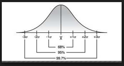
Normal Quantile Plots
Previously, we talked about z-scores and how they tell position on the Normal Curve - but how do we know if the data fits a Normal Distribution in the first place? A Normal Quantile Plot (also sometimes called a Normal Probability Plot) can give us an idea of Normality of the data. Put your data into L1, then go to Stat Plot and choose the very last graph. Don't forget to go to zoom - 9(stat) to get a good view of your graph!
We look for three characteristics of the data to assess Normality. 1) Does the data roughly form a straight line? Or do we see curvature at the ends? 2) Is the data centered about the x-axis - do we see roughly equal observations above and below? And finally, 3) Does a majority of the data appear to be in the middle of the graph rather than in the tails? If the answer to these 3 questions is "yes" then we can assume that our data appears roughly Normal.
Note that this is our ASSUMPTION based on our OBSERVATIONS. We didn't actually PROVE anything with our Normal Quantile Plot. Choose your language carefully when you interpret this.
Normal Curve and Z-Scores
The Normal Curve is otherwise known as the bell curve. It is a symmetric distribution centered about the mean and spread out by standard deviations. 68% of the data lies within the first standard deviation. 95% lies between the first two standard deviations. And 99.7% of the data falls within the first 3 standard deviations. Anything outside of the first three standard deviations is considered an outlier of the data (which means that 0.3% of the observations will be outliers).
To calculate position on the Normal curve, we can use the z-score formula, which is the sample mean minus the population mean, all over the standard deviation. Our answer (the z-score) can be interpreted as the number of standard deviations (positive or negative) above or below the mean.
To calculate position on the Normal curve, we can use the z-score formula, which is the sample mean minus the population mean, all over the standard deviation. Our answer (the z-score) can be interpreted as the number of standard deviations (positive or negative) above or below the mean.
Tuesday, September 10, 2013
Standard Deviation
The standard deviation is how far away each observation is, on average, from the mean of the data. We use standard deviation as a measure of spread about the mean, just as we use the interquartile range as a measure of spread about the median. Standard deviation, as paired with the mean, is typically used in symmetric or roughly symmetric data sets.
We can calculate the standard deviation using a long formula, or we can simply find it in the calculator when we do a 5-number summary (1-var statistics). Don't forget to always interpret it in the context of the problem!
We can calculate the standard deviation using a long formula, or we can simply find it in the calculator when we do a 5-number summary (1-var statistics). Don't forget to always interpret it in the context of the problem!
Monday, September 9, 2013
Guest Speaker from Fayetteville
Dr. Watson, a petrochemical engineer from the University of Arkansas, stopped by the library today to talk about a two-day trip opportunity. He also discussed ACT score and how important it is to the college application process. You need a 19 to get into the University of Arkansas unconditionally, and 18 to get in with remediation classes.
Remember, I do after school ACT prep from 3:40pm - 5:40pm in Mrs. Cain's room - 120. We cover all the subjects: Mrs. Cain does English and reading, I do math and science (aka how to read graphs properly). Come and join us - practice makes perfect!
Shout out to Nakeya and Antonia for coming after school today, and shout out to Trey and Megan for ZAP-ing their tests for a better grade.
Sunday, September 8, 2013
Hints for Problem Set #2
Problem 1A: Think about what type of data is displayed in a histogram, and think about how many random variables that Mrs. Timmons is trying to work with. For part three, I'm asking what features she might see in the histogram IN GENERAL. I didn't provide you with one. But if she was looking at a histogram, what would she see? Think: CUSS....and go from there.
Problem 1C: Think about the shape of the histogram: given this specific shape, which estimate should be higher, the mean or the median? Check your notes from Friday, August 30th if you're stuck. I'm looking for an approximation here, there's no "right" answer as long as you justify it properly in part B.
Problem 1D: How can we measure center? There is, as we know from our notes from August 30th, more than one way....
Problem #5: Assume that you're taking the median of the 6 existing weights of luggage - that is, don't count x7 just yet. Otherwise, you're not going to be able to start the question.
Thursday and Friday: Cities Survey/Experiment
Does giving a point of reference increase accuracy in estimation? Students worked in partners to explore this effect. Each group chose a city, then asked 15 different people (each): how many people do you think live in this city? OR, How many people do you think live in this city, given the 2010 population?
Most groups should have found that their data is more spread out without giving a reference point. When we throw in a reference point (otherwise known as an "anchor"), people then have grounds in which to base their estimation. Otherwise, they are relying solely on their prior knowledge of the city when making an estimation.
Students then turned in 7 questions about their findings. One key point to reinforce is that, when given symmetric data, use the mean as a measure of spread. When given skewed data, use the median as a measure of spread.
Shout out to Issac Wilburn and Josh Reynolds for working with remarkable intensity during the entire class period on Friday!
Wednesday, September 4, 2013
Boxplots and the 1.5 Outlier Test
Boxplots display univariate, quantitative data. The data is ordered and placed into quartiles. Quartiles 1 and 4 are represented by the whiskers, and quartiles 2 and 3 (called the Interquartiles, since they represent the middle 50% of the data) are represented by the boxes.
We can CUSS about the boxplot because they show center (the median), outliers (via the 1.5 outlier test), shape (look for symmetric versus skewed), and spread (look at the range or the interquartile range).
Problem Set 2 was given out in class today. Check tomorrow's blog post for hints for question 1.
Thursday, August 29, 2013
Chapter 1 Test: Univariate Graphing
Our first stat test was today! Thanks for sweating it out in the lecture hall and for working with so much perseverance. In general, what you experienced on the exam today is the level of difficulty that you should expect on all Statistics exams.
Because this was our first AP exam experience, I considered a 3/4 on the open response questions to be 100%. This will not continue for much longer, but for now, I don't want you to become discouraged if your responses aren't perfect. 4/4 got you extra credit points.
Question 1 on the multiple choice wasn't counted and I gave it as free points. It didn't make much sense otherwise.
Wednesday, August 28, 2013
Univariate Review/Multiple Choice
We reviewed our entire first chapter today on univariate data/graphical displays. Some important notes to remember for tomorrow's exam.
-10 multiple choice, 3 open response, you choose the two open response that you want to complete. If you do all three then I take the highest two.
-You may bring one 8.5 x 11 sheet of notes with you - front side only.
Something that I forgot to mention in class is that WE WILL BE TESTING IN THE LECTURE HALL. Please report there first period.
I realize that there are bag checks in the morning. I need you to realize that I have a class 2nd period. Don't take all day to get to the lecture hall - the longer you take to get there, the less time you will have on your test. Make good decisions.
Answers to today's multiple choice questions are:
1) C
2) C
3) C
4) B
TI.1) D
TI.2) B
TI.3) B
TI.4) B
TI.5) B
TI.6) D
TI.7) don't worry about this one yet - quartiles are coming up later, probably next week
TI.8) don't worry about this one yet - we'll compare means next week
TI.9) E
TI.10) B
TI.11) D these are comparative boxplots - our next unit.
Go through the open response questions and, for everything except TI.12) part c, make sure that you'd know how to answer the question. You don't necessarily have to do all the questions, just know what you'd write or calculate if you were answering them. Plus five bonus points on your test if you write one thing that you like about AP Statistics on the back of the last page of tomorrow's test.
Happy studying!
Tuesday, August 27, 2013
Univariate Open Response
AP free response requires acute understanding of statistics. Today we discussed a time series open response, a bar graph response, and how the responses are graded. Remember, you get E for essentially correct, P for partially correct, and I if any part of your response is incorrect. Your final score is graded out of 4.
Remember to be VERY SPECIFIC in your responses! Never use words like "it is" when you could be saying something like "the data is..."
Remember to be VERY SPECIFIC in your responses! Never use words like "it is" when you could be saying something like "the data is..."
Monday, August 26, 2013
Hint for Problem 2, Part E, Part C
Part E of problem 2 asks if a histogram would be appropriate given the data. Consider what your data is ACTUALLY composed of: 200 zeroes, 85 ones, 45 twos, and so on. Remember that you are measuring the number of impairments, not the frequency. Frequency is simply the number of times that number shows up in the data.
Given that your data is composed of a bunch of zeroes, ones, and other small numbers, would it MAKE SENSE to use a stem and leaf plot here?
Problem Two part c asks to make a relative frequency histogram. Normally we can do this on the TI, but that trick only works if we have the raw data. We only have the frequencies. Use those to make your histogram. Don't forget to label and title!
2-Way Contingency Tables
Two-way contingency tables are used to compare two QUALITATIVE variables, such as gender versus political party, or uniform shirt color versus uniform pants color. We make the table and then find the totals for all variables by counting the number of observations in each.

This is an example of a 2-way contingency table. We can find the marginal distributions by looking to the row/column totals and dividing by the grand total. For example, if we wanted to find the marginal distribution of yes event observed, we would do 8/28. A conditional distribution is conditioned on one of the variables within the table. For example, if we said "find the conditional distribution of no event observed conditioned on yes event forecasted, we would do 16/18. Usually, we write these answers as a percentage rather than a fraction.
For five extra bonus points on your next problem set, find and interpret the conditional distribution of yes event forecasted conditioned on no event observed. I will take your submissions up until this Friday, August 31st.
Saturday, August 24, 2013
Hints for Problem Set 1, Question 1
Problem 1, Part B, last part: Think about the type(s) of variables that Mrs. Long is measuring, and think about what type of information that a histogram contains (which we went over in class on Friday). Does it make sense to use a histogram given the types of random variables?
Problem 1, Part C: refer to the chart that we made in class on Friday. There is definitely more than one possible correct answer for each scenario, make sure you justify it properly. Complete sentences, please!
Problem 1, Part E: think about a variable that you would observe in real life where, if you made a graph of it, would be roughly distributed symmetrically or skewed.
Scatterplots
Scatterplots compare two bivariate variables. Our independent variable goes on the x axis and the dependent variable goes on the y-axis (think back to algebra 1, here). While we can't CUSS for a scatterplot in the exact same way, we do describe three aspects of the data:
1) Direction - do the observations appear to be going in a positive or negative direction?
2) Strength - are the observations close together? Far apart? Not correlated at all?
3) Linearity - do the data appear to be in the shape of a straight line?
1) Direction - do the observations appear to be going in a positive or negative direction?
2) Strength - are the observations close together? Far apart? Not correlated at all?
3) Linearity - do the data appear to be in the shape of a straight line?
Histograms
Histograms are used to graph univariate, quantitative data. We like to use these particularly when we have continuous data (data with decimals), but they can still be used for discrete data (whole numbers) as well.
NOTE: Histograms are NOT the same thing as a bar graph!! Bar graphs chart qualitative data while histograms chart quantitative data.
To make a histogram on the TI-84, enter your data into L1. Go to Stat Plot, turn the graph on, pick the one that looks like the histogram. Then press zoom - 9) Statistics.
Wednesday, August 21, 2013
Comparing Distributions
In the case of more than one graph, it makes sense to compare distributions of the same random variable. For example, we could compare the number of times girls can hop on one foot in a minute to the number of times boys could hop on one foot in a minute in terms of center, shape, spread, and outliers (CUSS). We did this today in class with two stem-and-leaf plots. Make sure to use comparative language such as "greater than," "smaller than," etc. and keep it in the context of the problem.
Shout out to Deja Collins for figuring out why it's not appropriate to CUSS when we're looking at a bar graph. Remember, you can only CUSS about QUANTitative data! Nice work!
Shout out to Deja Collins for figuring out why it's not appropriate to CUSS when we're looking at a bar graph. Remember, you can only CUSS about QUANTitative data! Nice work!
Tuesday, August 20, 2013
Describing a Distribution
Today we learned how to describe distributions via dotplots. We need to CUSS when we do this - meaning, we need to mention Center, Unusual Observations, Shape, and Spread. BE SPECIFIC when you do this, putting everything in the context of the problem!
The first problem set was given out today. It is due Wednesday, August 28th. Make sure that all of your graphs contain titles and labels.
Shout Out to Toni Clinton for calling me and asking a question about the problem set - way to go! VERY impressed that you started it already and I'm proud of your time management skills.
Monday, August 19, 2013
Monday August 19
Today was weird because we were cut short by a pep rally. The class went over the syllabus, expectations, and supplies for the class. We discussed the high expectations for this class - it is one of the most challenging in the school in terms of workload and dedication. However, the test is certainly passable with hard work and commitment to understanding the material.
All students in the class will take the AP Exam in May. This class is an ELECTIVE - it is a choice, not a requirement. If you don't want to be in the class or don't think that the workload is something that you can handle - that's fine - I won't be offended. Talk to your counselor about scheduling options that make sense for you.
Tuesday, June 11, 2013
Welcome to AP Stat!
Welcome to AP Statistics - a course designed to challenge your thinking and expand your math capacities in real-world contexts. My name is Ms. Doc and I will be your instructor throughout the course of this year.
To prepare for this class, students should have some familiarity with comprehending various types of graphical displays. Specifically, you might want to look over bar graphs, pie graphs, stem-and-leaf plots, box-and-whisker plots, scatterplots, and histograms. We will be covering them and testing over them in the first ten days of the school year.
Looking forward to a great year - come prepared to learn a LOT!
Subscribe to:
Comments (Atom)